Button
5 variants · 3 sizes · icons · loading · disabled
Guide

Open-source design system · v1.2
A universal, monochrome, accessibility-first design system for web and mobile, written so that designers, developers and AI coding agents can all follow it.
Get started
Load the tokens, the stylesheet, React 18 and the bundle. Components are on window.AaNAD. Switch themes with data-theme on <html>, or follow the OS with AaNAD.watchSystemTheme().
<link rel="stylesheet" href="tokens/tokens.css">
<link rel="stylesheet" href="dist/aa-nad.css">
<script src="https://cdn.jsdelivr.net/npm/react@18/umd/react.production.min.js"></script>
<script src="https://cdn.jsdelivr.net/npm/react-dom@18/umd/react-dom.production.min.js"></script>
<script src="dist/aa-nad.js"></script>

const { Button } = AaNAD;
ReactDOM.createRoot(app).render(React.createElement(Button, { variant: 'primary' }, 'Continue'));
Foundations
Every value below is read from tokens.json and reflects the theme you've chosen. Use the token names, never the raw values.
Components
Live demos rendered from dist/aa-nad.js. Try them with the keyboard: every widget follows the WAI-ARIA patterns.
5 variants · 3 sizes · icons · loading · disabled
GuideIcon-only, always labelled
GuideInline, standalone, external, disabled
GuideLabel · helper · error · icons · prefix · disabled
GuideCharacter count, error, disabled
GuideNative select with placeholder, error, disabled
GuideChecked · indeterminate · error · disabled · group
GuideVertical with descriptions, horizontal, error
GuideOn · off · description · disabled · label start
GuideValue output, custom format, disabled
Guide2–5 options, icons, sizes
GuideType to filter · ↓↑ Enter Esc · live result count
GuideTags inside the field · Backspace removes · max
GuideDropzone · button · progress · errors · retry
GuideKeyboard grid · today · selected · disabled dates
GuideField + popover calendar
GuideTones · solid/subtle/outline · dot · count
GuideRemovable · selectable filter chips · hues
GuideIllustrated · initials · fallback · sizes · status · group
GuideOutline · elevated · filled · clickable · actions · footer
GuideHorizontal · vertical · labelled
GuideIcons · avatars · meta · actionable rows
GuideCaption · sortable · striped · status cells
GuideIonicons 8 · outline + filled · 16/20/24/32
GuideRatios · radius · fallback on error
GuideSnap scrolling, buttons, dots, no autoplay
GuideInfo · success · warning · danger · neutral · dismissible
GuideNeutral · success · danger with action · stacking
GuideHover and focus; Esc to hide
GuideSizes; pulses under reduced motion
GuideDeterminate · indeterminate · success · danger
GuideText · rect · circle; static under reduced motion
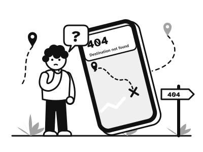
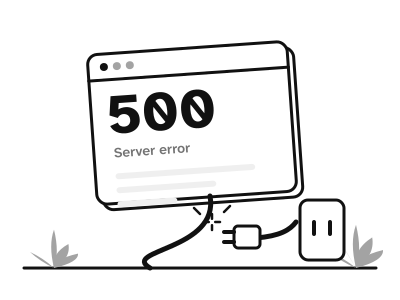
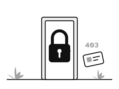
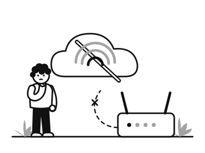
GuideErrors · empty · success · onboarding with illustrations
GuideModule Aa brand loader · sizes · inverse
GuideDialog and alertdialog; focus trap, Esc, scroll lock
GuideSide panel for filters and secondary tasks
GuideMobile sheet with handle and actions
GuideActions dropdown: arrows, type-ahead, danger item
GuideLine · contained · icons · badge · disabled
GuideDivided · contained · single or multiple
GuideChevron/slash · collapsed middle · current page
GuideKnown total · page size · unknown total
GuideHorizontal · vertical · complete/current/error
GuideWeb top bar and mobile app bar
GuideMobile bottom navigation, 3–5 items
GuideAssets






Guides